When it comes to mid-term rentals, your property’s interior design is key. It can either draw in your perfect guests or push them away. If you’re an investor with an MTR, stick around because this episode is all about MTR design. For all the info and details, make sure to listen to the whole podcast episode. Or you can read the some of the highlights below.
Listen to the Design Your Home Podcast
Mid-term rentals, or MTRs for short, are the sweet spot between short-term stays and long-term leases. Now, why focus on design for these?
Before we dive in, I’ve got something exciting brewing. I’m launching a special design program tailored just for MTR owners.
Over the past weeks, I’ve been chatting with fellow investors, helping them jazz up their spaces. And let me tell you, the right design can make or break your bookings.
I’m opening up spots for founding members in this program, but they’re limited. If you’re itching to join, head over to nestorations.com/property to secure your spot. Trust me, you won’t want to miss this chance to elevate your rentals and boost your income.
Go ahead and sign up.
Why Does the Design Matter in Your Mid-Term Rental
With more people jumping into real estate investing than ever before, competition is fierce. Short-term rentals like Airbnb and Vrbos are flooding the market.
In just five years, the number of Airbnbs has shot up by 51%. However, individual hosts are feeling the pinch as occupancy rates drop and regulations tighten.
Many underperforming short-term rentals are shifting gears to medium-term rentals to stay afloat. This surge in competition means your rental needs to catch the eye and stand out. Otherwise, you’re stuck with an empty property and bills to pay.
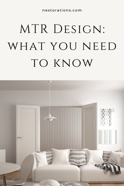
Design Your Mid-Term Rental AS IF You’d Live In It
Now that we understand the importance of your mid-term rental design, let’s explore some essential tips for crafting it.
First off, design your rental as if you’d live in it yourself. Ask yourself: Does it meet the standards you’d expect for your own home? Or did you settle for the cheapest options, assuming they’d suffice for your guests?
Truth is, if you’re aiming for good reviews and a fully booked calendar, your property’s design matters here. Simply tossing furniture together won’t do the trick.
Remember, if it’s not up to your standards, your guests likely won’t find it appealing either.
Good Design Changes How We Feel in a Space
Let me share a fascinating study with you about the impact of design on our feelings in a space. Back in the 1950s, Abraham Maslow and Norbert Mintz conducted what’s known as the “Ugly Room Study.”
They created three rooms: a beautifully designed one, a sterile office-like space, and an ugly, dirty, neglected room. Participants were placed in each room and shown photos of people.
In the beautiful room, everyone felt positive and happy, while in the ugly room, reactions were negative. Surprisingly, the basic, clean room elicited similar negative feelings as the ugly room. This shows that even a clean room might not feel good without thoughtful design.
Investors often overlook design elements, focusing on cleanliness but missing the mark on ambiance. A well-designed space leads to happier guests, better reviews, and longer stays.
For example, in our own MTR, good design led to extended bookings, saving us time and hassle. It’s a win-win situation!
With Mid-Term Rentals You're in the Hospitality Business
I want to share some insights from conversations I’ve had with real estate investors about their investment properties. One thing that stood out to me is the language we use to refer to the people staying in our properties. Instead of tenants or renters, I prefer to think of them as guests. It changes how we treat them and elevates the experience.
Since these guests stay longer, it’s crucial to make them feel comfortable and at home. Viewing them as guests in our homes shifts our mindset and improves their experience. Remember, you’re in the hospitality business, and treating your guests that way makes a difference.
With short-term rentals, guests might overlook dated designs if the location is really great. But for mid-term rentals, design is crucial because guests stay longer. Your space should feel welcoming and comfortable since it’s their home away from home. What’s acceptable for a short stay can become tiresome over months. So, when designing your mid-term rental, consider how the design affects the guest experience.
Guests Treat Your Property Differently Based on How Expensive it Looks
Let’s talk about something interesting—how guests treat your property differently based on its appearance of expense.
Think about this: have you ever noticed how you behave differently in a Walmart compared to a high-end store like Nordstrom or Saks Fifth Avenue? At Walmart, people tend to ignore items or leave them lying around. But in a high-end store, we’re more cautious, treating items with care and respect.
Apply this concept to your rental property. Make it feel like Nordstrom, not Walmart. Guests will treat it with care, keeping it cleaner. And the best part? You don’t need to break the bank to achieve this.
In my own home, I’ve noticed that when it looks nice, guests are more mindful. They hesitate to dirty or damage anything. The same principle applies to your rental—invest in quality pieces that give off an upscale vibe.
While you can’t control everything in your rental, a well-designed space encourages respect from guests. So aim for that Nordstrom level of sophistication in your mid-term rentals.
Final Thoughts...
If you want to discover the secrets of enhancing your mid-term rental design, I’ve got just the thing for you. Picture your space catching the eye of every potential guest, and securing top-dollar bookings.
Well, here’s your chance to make it a reality: head over to nestorations.com/property and sign up for my exciting new program.
We’re launching this month, and you won’t want to miss out on this chance to elevate your property and attract more guests.
Let’s make your place irresistible to potential guests!
Connect with me:


