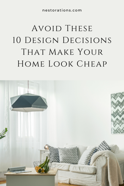
Are you making design choices that cheapen the look of your home? Today, I’ll share the top 10 design decisions to steer clear of if you’re aiming for a high-end aesthetic. Let’s explore what to avoid to elevate the appearance of your home or investment property. Keep reading or listen above to find out. Let’s dive in.
Listen to the Design Your Home Podcast
1. Matching Furniture Sets Make Your Home Look Cheap
Let’s talk about furniture sets. While it might be tempting to grab a matching set from your local store or online, it might not be the best move for your space. Sure, it feels like a safe bet, ensuring everything coordinates, but hear me out. Matching sets can make your home feel a bit, well, generic. There’s no personality, no character. And let’s face it, it can come off as boring and cheap.
What we want is a space that feels unique, collected, and curated over time. We need layers and dimensions. That goes for our homes and even investment properties. So, my advice? Mix it up. Skip the safe route and let your space reflect your personality.
2. Too Much Put-Together/DIY Furniture
We all have different budgets, especially my real estate investor listeners diving into designing their midterm or short-term rentals. Incorporating a bit of IKEA here and there can be convenient—I’ve done it myself. But like candy, too much isn’t great. It’s okay to sprinkle in some flat-pack furniture if needed, but let’s avoid going overboard. Keeping it balanced and in moderation adds to the cozy ambiance of your home!
3. Furniture That’s Out of Scale
Choosing the right furniture is a big decision for your home’s aesthetics. It’s common to see furniture that’s too small, making the space feel underwhelming. It’s better to opt for fewer, larger pieces rather than cluttering with small items. Ensure that your furniture fits the scale of the room—larger rooms need bigger furniture, while smaller ones can handle smaller pieces. Fill the space appropriately so it doesn’t feel empty.
4. Generic, Basic Art Makes Your Home Look Cheap
Let’s talk about art. The wrong kind can cheapen your home. Good art should accentuate your home, add visual interest, and make it look layered and interesting. Even if you’re on a budget, you can find great pieces at HomeGoods, Target, or discount stores like Ross and Burlington.
Amazon also has options, though quality varies. Remember, art is subjective, but avoid anything overly generic or basic.
Recently, I stumbled upon a cluster of art on Amazon with over 3,500 reviews from a company called, Weico. And although it’s a good size and a low price, it looks cheap and mass-produced so I personally wouldn’t use it in a design project. They do carry other pieces that might be okay, but this particular one I’m not a fan of.
Aim for art that’s timeless, fills the space, and feels high-quality, and not like everyone else has it.
5. Too Much Word Art Makes Your Home Look Cheap
Here’s a friendly tip: too much word art can cheapen your home’s vibe. While a subtle touch of quotes or phrases can be nice, overdoing it isn’t the move. Think quality over quantity.
For instance, I have a quote in my walkthrough pantry that is on a beautiful canvas. But let’s steer clear of those giant word decals or obvious signs stating the obvious (like “Eat” or “Kitchen”). Instead, opt for something more visually interesting to spruce up your space. So, let’s gather those “gather” signs and find something that different for your space.
6. Avoid Basic Builder Lighting
Basic builder lighting isn’t doing your home any favors. Nowadays, quality lighting is affordable, with plenty of interesting options to fit any budget. I once transformed a basic builder chandelier by spray painting it with a hammered finish. This simple change turned a cheap brass fixture into something custom-looking.
You don’t always need to buy new; inexpensive chandeliers from home improvement stores or online retailers like Amazon or Wayfair can give you a higher-quality appearance. Look for designs with clean lines for a more upscale look.
7. Mismatched Flooring Makes Your Home Look Cheap
Consistent flooring throughout your main living areas creates a cohesive, upscale appearance. While it’s fine to have different flooring in bathrooms or mudrooms due to practical considerations, maintaining flow in the main areas is key.
Sure, updating flooring can be a significant investment, but it’s worth considering. Even if it’s not at the top of your list right now, it’s a change that will noticeably elevate your home’s aesthetic and banish that “cheap” vibe.
8. Avoid Small Rugs
I see this a lot in photos of investment properties and online homes. Small rugs throw off the room’s balance and don’t elevate its look. We don’t want our rugs to look like a tiny island floating in the middle of the room.
Sure, smaller rugs are less expensive. If cost is an issue for you, opt for polypropylene rugs—they’re affordable, stain-resistant, and pet-friendly. You don’t have to break the bank for a great rug. Stores like Home Depot, Lowe’s, Home Goods, Target, Ross, and Burlington offer stylish options at affordable prices. So, you can elevate your space without emptying your wallet.
9. Plain, Flat Throw Pillows Make Your Home Look Cheap
I recently covered this topic in-depth in Episode 50, so check that out for detailed tips.
The key is to opt for throw pillows with different textures and patterns because that adds variety and layers to our home. While a plain pillow here and there is okay, too many can dull your decor. Remember, we want it in small doses.
So go back and listen to Episode 50 for all the pillow talk about throw pillows.
10. Clutter Makes Your Home Look Cheap
It might seem trivial, but tidying up can instantly elevate your home’s appearance without breaking the bank. Clutter not only cheapens the look of our homes, but also adds unnecessary stress to our lives.
Research even suggests that a cluttered environment can spike our stress hormone, cortisol, keeping us in a constant state of fight or flight. So, it’s time to declutter and reclaim your space. Find designated spots for items because creating organized areas can help maintain order and reduce the overwhelming feeling of clutter.
Remember, mess equals stress. By tackling clutter, you’re not only enhancing the aesthetics of your home but also lowering your stress levels. This translates to a more inviting and expensive-looking space, which is always a win-win. Plus, if you’re in the rental game with properties like Airbnb, a clutter-free environment can attract more guests and lead to increased bookings.
Final Thoughts...
If you’re nodding along realizing your home needs a little help, then jump on the waitlist for my design training and programs tailored just for you. With Room Design Essentials, you’ll be creating professional results right in your own home.
And for all the savvy real estate investors out there, get ready for something special. Stay tuned for my upcoming program crafted specifically to stop the scroll and boost your bookings. Let’s turn those browsers into bookings and elevate your investment game.
And remember, if you need a guiding hand, don’t hesitate to slide into my DMs on Instagram @nestorations. Let’s make your dream space a reality.
Discover How to DIY Your Design and Save Thousands of Dollars
Connect with me:


