Do you ever walk into someone’s home and just marvel at how good it looks? Your eyes hop around the room and everything just seems to flow. It’s perfectly accessorized. You aren’t quite sure why but you know it just looks good.
Well, my friend…it’s likely because they embrace what interior designers call the “rule of three.” And the good news is that your house can look like that, too. Read on to see how.
What is the "Rule of Three"
In a nutshell, the rule of three suggests that things grouped in threes are more natural, harmonious and visually appealing. Odd numbers challenge our brains a bit and are more interesting. The Latin phrase “omne trium perfectum” means “everything that comes in threes is perfect, or, every set of three is complete.” And when it comes to design that definition fits perfectly. Our eyes naturally are drawn to groups of three.
But wait, Sally. I thought design is about balance so shouldn’t I use pairs to keep things symmetrical? Well…yes and no. You’re right that design is about balance but we have to balance both symmetry and asymmetry.
Pairs of objects can feel formal and symmetry can even feel a bit stuffy at times. So, you can soften those pairs by adding a group of three. For example, if you have a pair of lamps on a console table in your foyer (that’s your symmetry) add a group of three accessories by one of the lamps (your asymmetry). The image below of my own foyer console table is a good example of combining symmetry and assymetry. The combination feels balanced, but not stuffy.
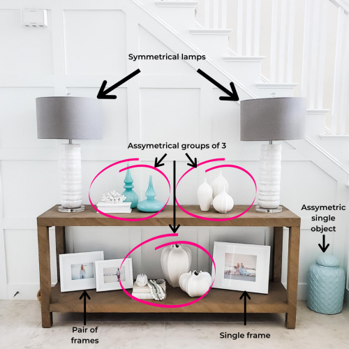
What about other odd numbers? Can we have one or five accessories? Well, you could, but one accessory on it’s own is pretty boring and 5 can be overwhelming and busy. Three is the sweet spot.
Use the rule of three with color
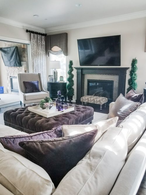
When you select the colors for your room you also want to think in threes. Three colors in a room is very complimentary and soothing on our eyes. The first color is your main color, the second color is still prominent, but not as much as the main color. The third color is your accent color that you use sparingly or sprinkled here and there. If you’re into numbers you could break this down into 60%, 30%, and 10%. Main color: 60%. Secondary color: 30%. Accent color 10%.
In this example below, the main color is our beigey/neutral. The secondary color is brown and the accent color is purple.
Use the rule of three with accents/decor
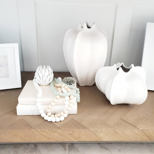
When accessorizing your home you really do want to add some groups of three. It keeps things interesting. You could have three vases or three objects grouped together to create a small vignette. It looks put together and is easy on the eyes.
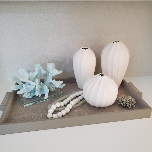
When using a group of three accessories sometimes a pair or cluster of accessories acts as one. In this example below my group of three is: a tall vase, a smaller vase, a stack of books with beads and porcelain flowers (these act as one).
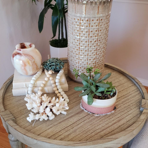
Below is a cluster of accessories on an end table. The stacked books with beads and decor is one part of the “three”, the coral is one part and the succulent vase is the third in the trio.
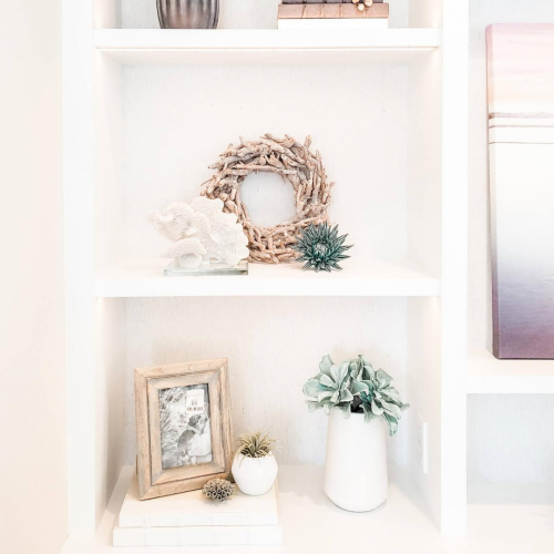
This last example shows how the rule of three works in a bookcase in my client’s home. The shelf with the driftwood wreath has three objects grouped together– the wreath, the coral, and the teal porcelain flower. I love the way this grouping looks together.
Final thoughts...
Now, I don’t recommend following every design “rule”. But, if you’re new to design then learning the rule of three will save you a lot of time and frustration when decorating your own home.
And as always, if you’d rather leave all this styling to the pros then reach out to work with me. All you have to do is fill out a few questions on my contact page (it will take you 2 minutes) and you’ll get to schedule a complimentary call with me to talk about your home. How great is that?
Where can you use the rule of three in your home?

