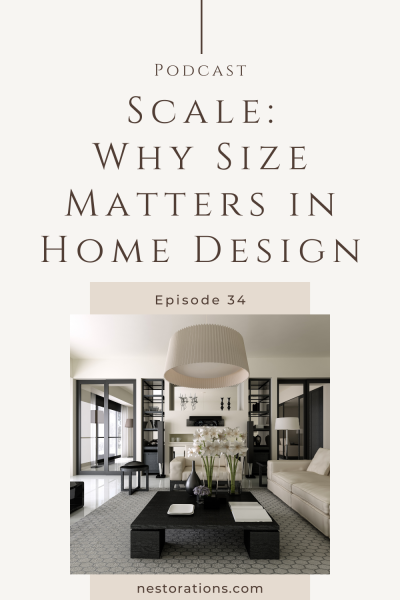
Size matters…well, at least when it comes to home design it sure does. In the design world, we call it scale-and it’s one of the main foundations in all good design. And if you think you can create an amazing room design without knowing about scale, then I have to respectfully say that you’d be wrong. So read on, or listen in, to find out more about scale so your home or Airbnb looks its best.
Listen to the Home and Nestorations Podcast
Today we’re talking about size, because well…size matters. At least when it comes to home and interior design.
Scale is one of the 6 main principles of Design that make up a well-designed room. I go into depth about all of these in my Room Design Essentials program and if you want to learn more about that, go to nestorations.com/waitlist and you’ll get all the details very soon.
Design Principle of Scale
Scale is actual or overall size of a room, object, or pattern.
For example:
- A large sofa or a small sofa
- A large room or a small room
And when it comes to fabrics, wallpaper, or wood focal walls the patterns can also be large or small. Think of a wide stripe versus a smaller, thinner stripe. Or think of a big print versus a smaller busier pattern. On a wood focal wall there could be large rectangles or small squares in your pattern.
In room design we have to consider the scale of the room and objects in the room because it makes for a better design. If the scale is off, the room will look off and won’t look good.
The Visual Weight of an Object
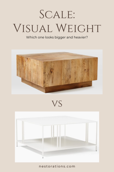
Scale also refers to the visual weight of an object or how the object appears.
What do I mean by visual weight? Imagine you have two coffee tables: one has a glass top with thin legs and the other is solid wood with chunky legs. The glass table will feel smaller because it’s lighter in feel and we can see through it, while the solid wood table will feel heavier and larger, taking up more visual space even though they’re the same size. Another example is a sofa or a chair that goes all the way to the floor (with no legs showing) compared to seeing legs under the furniture. The one that goes to the floor will look heavier or larger in scale.
When it comes to fabric patterns, different patterns can impact how a fabric feels. Darker fabrics with large scale patterns are more dominating and make something appear larger or heavier. While, sheer or lighter fabrics with subtle prints will smaller or lighter in visual weight.
Your home’s color palette also impacts your home. Darker, bold colors can make your home feel smaller and more cozy. While lighter colors can open up a space and make it feel larger.
As you’re designing your room, think about the actual size and the visual weight of each piece in your room.

Design Principle of Proportion
Proportion is closely related to scale and although they’re considered separate design principles, I tend to group them together as a pair.
Proportion is how things in your room relate to one another. When pieces in your room are not in proportion to the room or each other, your room will look “off”. We want proportions that are pleasing to the eye.
For example, imagine a standard accent chair that you’d see in your living room. The seat, arms, and legs all work together. Now imagine that same chair with a super tall back. It would look kinda weird, right? Like it was something from Alice in Wonderland.
Or imagine a dining table that is really chunky, thick, dark and solid but it was on thin, skinny legs. That won’t work and you don’t need to be a designer to know that feels off or looks weird.
Proportions have been studied for centuries going all the way back to ancient Egypt and Greece. Proportions that were pleasing were called golden. You could hear of it as the golden ratio, golden proportion. Basically it’s about breaking up things into sections that are visually pleasing to our eyes. A 60/40 ratio feels good to us.
An easy way to connect with this is with standard rug and art dimension which closely follow the 60/40 proportion. For example, a 3×5 rug. a 4×6 rug or an 8×10 rug. It’s all about the proportions.
When you’re choosing pieces for your space or project you want objects that are proportional to each other and to your room.
A tiny room that has oversized, dominating furniture will feel visually off. And a giant, open concept room with dinky furniture will feel off, too.
Tips to Get Scale and Proportion Right
It’s helpful to take proper measurements to get the scale and proportion right in your home. Mapping out your furniture with blue painter’s tape will help you make sure your furniture is the right scale and that you have enough space to move around it.
When accessorizing, it’s helpful to snap a quick photo on your phone to look at the scale and proportion of different objects. It’s a simple trick that helps us see what we’re looking at differently.
If you want to learn more about scale and proportion and how to get it right in your home or Airbnb, sign up for Room Design Essentials, my step-by-step training to help you design your room from start to finish.
Learn how to design a room from start to finish with Room Design Essentials

Save money and learn to design and decorate your home or rental property with confidence. Get on the waitlist for Room Design Essentials today.
Connect with me:

