Console table, foyer table–whatever you want to call it, you definitely need to know how to style it. It’s likely one of the first things you and your guests will see as they enter your home each and every day, so you want it to look it’s best. Keep reading to learn these must-have styling tips.
FYI…This post is part three in my four part how-to style series. I encourage you to read about the other posts in this series: how to style end tables, how to style coffee tables, and how to style bookcases.
Look at your functional needs first
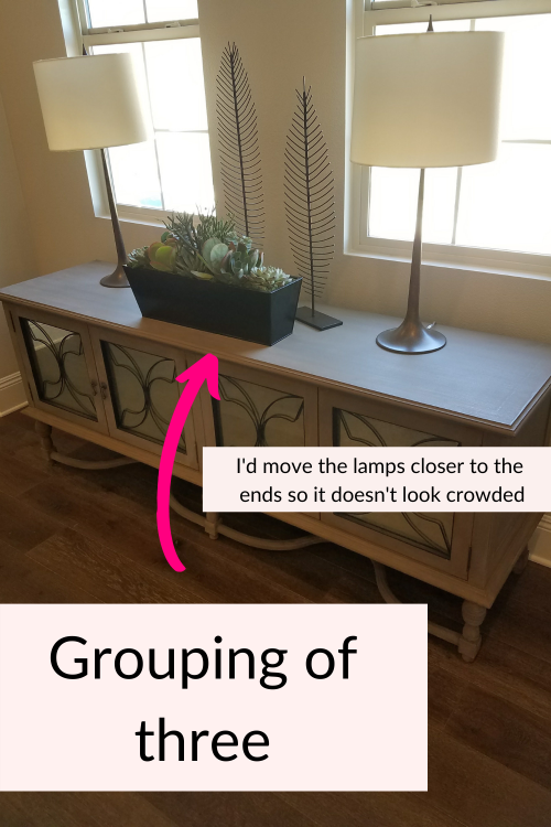
As much as I think the way your console table looks is important, you actually have to factor in your functional needs first. Depending on your home, you may need to add a lamp or two for additional light, or a place to store your keys and things you’ll drop by the door. The size of your console will determine if one lamp or two is best. If your console table is 60” or under you’ll likely use one lamp. Longer consoles can handle two lamps without looking over crowded.
If you do use a tall lamp(s) it’s good to add something shorter near it like a vase or stack of books to create visual interest. You always want to have objects of varying heights on your console table.
Use the rule of three
to style your console table
I’ve mentioned the rule of three a lot in this style series of blog posts because it’s an important style rule in design. In a nutshell, the rule of three suggests that things grouped in threes are more natural, harmonious and visually appealing. Odd numbers challenge our brains a bit and are more interesting. Our eyes naturally are drawn to groups of three.
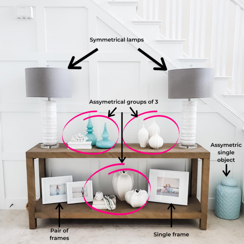
So as you style your console table, be sure to add a grouping of three to keep your decor interesting. In addition, add other objects in pairs or even a single object to add variety so you don’t have an entire console table filled with groups of three accessories.

Mix textures on your console table
When styling your console table be sure to mix up the finishes of your objects and accessories. For example, if you have a smooth glass lamp, add something natural or woven like a basket as another object. A mixture of textures is key to giving your decor an interesting look. You don’t want every object looking the same.
In the image below you can see how accessories were grouped as well as the different textures used. This console table has a lot of natural texture already. And the accessories have a mixture of textures from the books, beads, vases in a matte finish and glass objects.

Remember to leave negative space
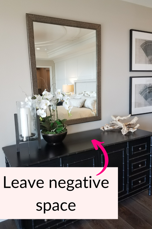
Another foyer styling tip is to leave some blank or negative space. You don’t want your console table to appear cluttered so don’t over style it. You want to space things out and have some negative space so your accessories are showcased.

Conclusion-Final thoughts
Styling console tables is a little more complicated than end tables and coffee tables, but I know you can do it. Play around with different options and layouts until you find one that feels right to you. You can always check out my Pinterest page for more style and decor inspiration. It’s a great starting point when styling your home.
Leave a comment and let me know what your console table style challenges are. I’d love to help you!

